

dbrimlow
-
Posts
712 -
Joined
-
Last visited
Never
Posts posted by dbrimlow
-
-
While Haku's solutions are correct to learn how to do it right, professionally and semantically, there is a very quick practical solution, by Stu Nicholls, that lets you create left/right fixed, center liquid, "equal height" looking columns.
http://www.cssplay.co.uk/layouts/flexible-3column-fix-flex-fix.html
The trick to the "equal height" looking columns, using background color, is giving the 3 columns ridiculously long "padding-bottom:32767px; margin-bottom:-32767px;", then putting them all within a wrapper that has "overflow:hidden".
The sliding-door technique is still best if using graphics.
This will let you start to at least get done what you need.
HOWEVER! It is not semantically correct. The right column comes before the center column in the markup (as you mentioned). This can cause confusion with screen readers and no professional would feel comfortable doing it.
-
The best css technique uses the sliding doors technique. It may add a little more markup but not much:
This link actually creates the graphics, CSS and HTML (you can use it to get the idea and reverse engineer it and create your own).
http://kalsey.com/2003/07/rounded_corners_in_css/
I never use JavaScript when there is a CSS solution.
-
Overflow: auto works great except it puts the scroll bar on the edge of that container
That's why many of us do not use it.
9 times out of 10 "position:absolute" is the problem. It is a very nasty element when used for layout and any liquidity is expected.
float AND position absolute is counter-productive - just use floats.
But you are ALSO designating fixed heights and 100% widths.
!00% width and float is also counter-productive.
You may not want to float.
But, to clear your #header float ...
Try this - just put it, as is, at the bottom of your css:
#header:after {
content: ".";
display: block;
height: 0;
clear: both;
visibility: hidden;
}
/* triggers HasLayout for IE6 */
* html #header {height: 1%;}
/* triggers HasLayout for IE7 */
*:first-child+html #header {min-height:1px}
-
Before making assumptions about floats and clearing,
I would like to see the css used for the containers. Does Zeradin use a fixed width or no width at all?
Was position:absolute used?
Are floated elements embeded in non-floated?
Is the nesting of the containers an issue?
Many things can cause a container to not be elastic - usually fixed or no widths designated.
************************************
Everyone has their favorite float clearing technique; there are potential issues with them all, particularly for cross-browser compatibility.
I still use and prefer the clearfix method - using the ":after" pseudo element and IE6 and IE7 HasLayout trigger hacks:
.header:after { content: "."; display: block; height: 0; clear: both; visibility: hidden; } /* triggers HasLayout for IE6 */ * html .header {height: 1%;} /* triggers HasLayout for IE7 */ *:first-child+html .header {min-height:1px} -
Get a book called "bulletproof web design - SECOND EDITION" by Dan Cederholm.
It is basically all about how to overcome this problem. It cannot be explained in a forum or by any answer like - use a liquid/elastic layout (which is one of the hardest animals to create for more than a simple text based site), or modify your pixel based fixed layout.
So many factors are involved that understanding exactly how to overcome the problems is required.
Dan's book did it for me.
-
Take a look at cssplay.com - Stu Nichols has a few drop down menu samples, like the following:
-
The reason no one is responding is because what you have there is NOT a web document.
And no one wants to try to explain even the most basics of html 101.
You are lucky the page displays at all.
It has no html structure. Not only is it "Quirks" mode and missing a doctype, it is also missing the html, title, head, encoding and body tags (open or closing)!
This doesn't conform to any known html that I've ever seen. And while, old html 2 or html 3 had a loose "optional" tagging requirement, this goes beyond that.
Get a book on xhtml and CSS ... you need to get away from the old optional html and get some strict tagging rules enforcement.
We can't help you without re-writing the page using proper html structure. Sorry to be so hard, but it is a truth.
-
THANK YOU! Can't wait to try it.
-
I appreciate any help with figuring out how to do this. I know it can be done because our competitors do it. I just don't see where to start. I'll try to give as much initial information as I can.
There are three different servers involved:
1. local office intranet
2. Craigslist
3. Our online web server
I need to track the number of visits to each of our real estate agents' active Craigslist listing ads, from within their control panel of the custom CMS application we created - see screenshot below - highlighted in yellow is new column that I want to ad.
The ads are submitted to craigslist via rss feed directly from a dedicated local intranet server - that handles nothing but our Craiglist ads management/submission program.
The ads don't allow any scripts or server side code to be included in the feed; they are sent via xml with only the most basic html tags. However, they do allow graphics/photos/data to be embedded from external sources (like our website host server). And I populate the listing data directly from our online listing database.
What I want to know is how would I actually track each visit to the ad thats on the Craigslist server itself (visit doesn't have to be unique - page refresh would count as a hit)?
I assume an embedded graphic of some kind in the ad that is named uniquely and dynamically - maybe same as the ad's postingID# - when uploaded to CL.
But how and where do I track the visits? in our local server? from our web server? I have to write to our database in order to generate the "visits" tracking column in the agent's management screen?
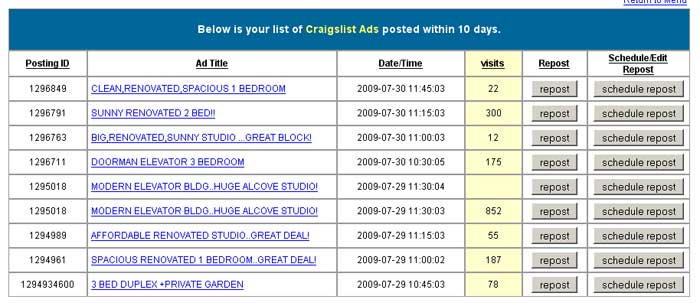
Thanks for anyone who attempts to tackle this.
Dave
-
First, so far as the clearfix, there is no "best way" - and some people don't even like this method at all. Use what's comfortable to you and does the job. To me, simply adding the class or ID of any floated element (that actually needs clearing) to the CSS clearfix select is simple and keeps my markup free of any unnecessary divs.
But about your liquid issue:
Without some kind of "faux column" technique, it is impossible to get two different boxes to be an equal height based upon the content of one of them; they are apples and oranges - completely unrelated to each other.
Once you removed the overflow:hidden on the container, and the large bottom margin and padding on the boxes, you disabled the whole faux column concept and illusion of equal height boxes. Percentage heights do not work for many reasons, one being (in the most basic sense) because they are EACH relative to a parent container and not content or each other. EM layouts have a little more relative control, but not much. And using position:absolute for any wire-frame non-fixed component instead of floats is guaranteed to be unstable in any modern browser.
You need to use some kind of illusion technique, like a graphic showing the two different backgrounds tiled in a parent container, or the Stu Nicolls technique I used of a huge padding-bottom (like 32767px) and an offsetting margin_bottom of equal-sized negative (like -32767px) to emulate equal heights, AND, MOST IMPORTANT, the overflow:hidden on the parent - this is what keeps the boxes appearing equal because the overflow is hidden based on whichever container has the most content. THAT is the key to the trick.
Here is the technique with a header and footer to show you that it works:
<!DOCTYPE html PUBLIC "-//W3C//DTD XHTML 1.0 Strict//EN" "http://www.w3.org/TR/xhtml1/DTD/xhtml1-strict.dtd">
<html xmlns="http://www.w3.org/1999/xhtml" xml:lang="en">
<head>
<meta http-equiv="Content-Type" content="text/html; charset=UTF-8" />
<title>Fixed left flexible right equal-height 2 columns</title>
<style type="text/css">
body {font-size:76%; font-family: verdana, arial, sans-serif; background: #FFFFDF; word-wrap:break-word;}
#container {overflow:hidden; background:#333;}
.menu {float:left; width:280px; padding:5px; color:#FFFFCC; background: #800000;}
.content {margin-left:300px; padding:.5em; background:#CCCCCC}
.menu, .content, .buffer {padding-bottom:32767px; margin-bottom:-32767px;}
h1 {font-size:150%; margin:0; padding:10px 0; color:#fff;}
h3 {font-size:130%; margin:0; padding:8px 0;}
li {list-style:none; text-decoration:none; margin:.1em; padding:.25em}
li li {list-style:none; text-decoration:none; margin:.1em 0; padding:.25em 0}
li a:link, li a:visited {display:block; background:#555; padding:.25em; border:1px solid #fff; color:#FFFFCC; text-decoration:none}
li a:hover, li a:active {background:#FFFFCC; padding:.25em; border: 1px solid #000; color:#800000; text-decoration:none}
p {font-size:1em; line-height:1.5em; margin:0; padding:5px 0;}
#header {background:#555; margin-bottom:2px; padding:1.5em; color:#444; font-weight:bold}
.contained {padding:10px;}
#footer {width:100%; border-top:2px solid #333;background:#555; float:left; text-align:center }
#footer p,
#header p {color:#fff;}
#footer a {color:#fff;}
#footer a:hover {text-decoration:none;}
</style>
<!--[if lte IE 7]>
<style type="text/css">
body {word-wrap:break-word;}
li {margin:.1em; padding:.25em}
li li {list-style:none; text-decoration:none; margin:0; padding:.25em 0}
.content {display:inline; float:left; margin-left:0; margin-right:0;}
#container {display:inline-block;}
</style>
<![endif]-->
</head>
<body>
<div id="container">
  <div id="header">
      <h1>Fixed left flexible right equal-height 2 columns with header and footer</h1>
      <p>This is bullet-proof (minimize your browser window and it does not blow-up).
        It contains some fundamental wireframe requirements that should NOT be
        modified. Using percentage height attributes defeat the whole point of
        the faux equal height columns. This is an extremely elegant solution
        that Stu Nicholes created rather than using graphics.</p>
  </div>
  <div class="menu">
  <div class="contained">
    <h3>Left 300px</h3>
    <ul>
      <li><a href="#">option 1</a></li>
      <li><a href="#">option 2</a></li>
      <li><em><strong>option 3:</strong></em>
        <ul>
        <li><a href="#">sub-option 1</a></li>
        <li><a href="#">sub-option 2</a></li>
      </ul></li>
      <li><a href="#">option 4</a></li>
    </ul>
  </div>
  </div>
  <div class="content">
   <div class="contained">
    <h3>Remainder in %</h3>
    <h3>The site content comes here and needs to fill the screen</h3>
    <p>No faux column image. Background colors give equal height impression.
      Layout concept is originally from a Stu Nicholes idea. This column is not
      floated for modern browsers, IE7 and above, but it IS floated left for
      IE6 (via conditional comment). </p>
    <p>You can add as much content as you like and the menu will still show equal
      height. Aliquam eu nibh eget diam hendrerit pellentesque. Proin ac risus
      metus. Curabitur ipsum ligula, bibendum ac rhoncus ut, mollis quis dolor.
      Proin lorem est, venenatis nec pellentesque eget, dignissim vitae nisi.
      Pellentesque ornare dignissim tempor. Sed elit sapien, pellentesque quis
      accumsan eget, vestibulum a sapien. Aliquam at consectetur odio. Proin
      ut velit nec nunc commodo iaculis sit amet eget lacus. Donec condimentum
      mollis lacus non interdum. Vestibulum at lectus lorem.</p>
    <p>"At vero eos et accusamus et iusto odio dignissimos ducimus qui blanditiis
      praesentium voluptatum deleniti atque corrupti quos dolores et quas molestias
      excepturi sint occaecati cupiditate non provident, similique sunt in culpa
      qui officia deserunt mollitia animi, id est laborum et dolorum fuga. Et
      harum quidem rerum facilis est et expedita distinctio. Nam libero tempore,
      cum soluta nobis est eligendi optio cumque nihil impedit quo minus id quod
      maxime placeat facere possimus, omnis voluptas assumenda est, omnis dolor
      repellendus. Temporibus autem quibusdam et aut officiis debitis aut rerum
      necessitatibus saepe eveniet ut et voluptates repudiandae sint et molestiae
      non recusandae. Itaque earum rerum hic tenetur a sapiente delectus, ut
      aut reiciendis voluptatibus maiores alias consequatur aut perferendis doloribus
      asperiores repellat."</p>
    </div>
  </div>
  <div id="footer">
      <p>Footer clears the ".menu" class here by using "set a float
      to clear a float". (In IE6 it clears ".content" class). </p>
      <p>If
      adding a third column, float it right,  remove the footer
      float and set a simple "clear:both" element. </p>
  </div>
</div>
</body>
</html>
This was based on an amazing 3 column technique by Stu Nicholls at cssplay.
various 3 column equal height, liquid/fixed layouts
Good luck,
David
P.S. For what its worth - my liquid project experience:
Creating a professional, practical, nice looking, liquid website for business is extremely hard. I set out @ 2 years ago to make a 100% liquid Real Estate Company website. EXTREMELY challenging and I was told it couldn't really be done. I specialize in Real Estate sites, so I know the challenges - fixed sized photos, search listing results requiring 5 or 6 multi-column boxes side by side IN ADDITION to the wireframe's columns, and other issues ... all generated dynamically.
The thing is, you have to get used to creating a text-only liquid wire-frame, first. And all of the techniques out there are based on text only wire-frames. Then, as soon as you start to add graphics or photos or media .... WHAMMO!! There goes the layout. And that's where you have to start making choices and settling for less than perfect.
I've come close, it scales perfectly on high resolution widescreen monitors (1280 x 1024 or higher) down to medium resolution (1024 x 768) but it does very well at low res (it gets wonky at an 800 x 600 and lower resolution - which of course is what our firm's CEO has his monitor set at). Since IE6 doesn't have a min-width, the layout doesn't hold up well when the browser window falls below 700px wide.
But, for the most part, I achieved what I set out to do. The site is liquid, elastic, holds up in high res, and only has problems in IE6 when the window is minimized below 750px wide. I could continue to tweak it and change things every day if I had the time. And some day soon will come back to it clean up the design.
I used the old "non-graphic rounded-corner technique" to emulate rounded corners, which looked fine in a fixed layout, but don't look as good when liquid.
Another difficulty is that I used a form search on the right column, there is only so much styling you can do with form elements ... by default these are for the most part controlled by the browser AND platform - like scrollbars - and may look different in Safari/Mac, FF/WinXP, IE7/Vista, seamonkey/Linux!
-
EXACTLY how Sufian shows you.
The entire point of CSS is to keep styling out of your markup and into a css where it belongs (note the "sheet" in CSS), using inline style tags is the same as using font tags ... it just adds unnecessary "weight" to your code and is not part of a "CSS".
-
Just a quick comment about the clearfix.
Like you, I prefer using a "clearfix" solution for clearing floats. However, you're using the old way originally intended to work with IE 5/Win, IE 5/Mac and IE6.
Instead of creating a whole new select item called .clearfix (and adding yet another div in your markup), just add the existing class or ID that you want cleared to it, like so:
#header:after, #footer:after {
content: ".";
display: block;
height: 0;
font-size: 0;
line-height: 0;
clear: both;
visibility: hidden;
}
/* target IE6 HasLayout trigger*/
* html #header, * html #footer {
height: 1%;
}
/* target IE7 HasLayout trigger*/
*:first-child + html #header, *:first-child + html #footer {
height: 1px;
}
-
How about a fixed left, liquid right, equal height columns, fully elastic text, compatible in all browsers incl. IE6?
<!DOCTYPE html PUBLIC "-//W3C//DTD XHTML 1.0 Strict//EN" "http://www.w3.org/TR/xhtml1/DTD/xhtml1-strict.dtd">
<html xmlns="http://www.w3.org/1999/xhtml" xml:lang="en">
<head>
<meta http-equiv="Content-Type" content="text/html; charset=UTF-8" />
<title>Fixed left flexible right equal-height 2 columns</title>
<style type="text/css">
body {font-size:76%; font-family: verdana, arial, sans-serif; background: #f0f0f0; word-wrap:break-word;}
#container {overflow:hidden; background:#333;}
.menu {float:left; width:280px; padding:5px; color:#FFFFCC; background: #0099CC;}
.content {margin-left:300px; padding:.5em; background:#CCCCCC}
.menu, .content {padding-bottom:32767px; margin-bottom:-32767px;}
h1 {font-size:150%; margin:0; padding:10px 0; color:#fff;}
h3 {font-size:130%; margin:0; padding:8px 0;}
p {font-size:1em; line-height:1.5em; margin:0; padding:5px 0;}
</style>
<!--[if lte IE 7]>
<style type="text/css">
body {word-wrap:break-word;}
.content {display:inline; float:left; margin-left:0; margin-right:0;}
#container {display:inline-block;}
</style>
<![endif]-->
</head>
<body>
<div id="container">
  <div class="menu">
    <h3>Left 300px</h3>
    <ul>
      <li>option 1</li>
      <li>option 2</li>
    </ul>
  </div>
  <div class="content">
    <h3>Remainder in %</h3>
    <h3>The site content comes here and needs to fill the screen</h3>
    <p>No fauex column image. Background colors give equal height impression. Layout
      concept is originally from a Stu Nicholes idea.</p>
    <p>Lorem ipsum dolor sit amet, consectetur adipiscing elit. Mauris ut ultrices
      sapien. Etiam aliquet ligula sed urna lobortis mattis. Aliquam eu nibh
      eget diam hendrerit pellentesque. Proin ac risus metus. Curabitur ipsum
      ligula, bibendum ac rhoncus ut, mollis quis dolor. Proin lorem est, venenatis
      nec pellentesque eget, dignissim vitae nisi. Pellentesque ornare dignissim
      tempor. Sed elit sapien, pellentesque quis accumsan eget, vestibulum a
      sapien. Aliquam at consectetur odio. Proin ut velit nec nunc commodo iaculis
      sit amet eget lacus. Donec condimentum mollis lacus non interdum. Vestibulum
      at lectus lorem.</p>
    <p>"At vero eos et accusamus et iusto odio dignissimos ducimus qui blanditiis
      praesentium voluptatum deleniti atque corrupti quos dolores et quas molestias
      excepturi sint occaecati cupiditate non provident, similique sunt in culpa
      qui officia deserunt mollitia animi, id est laborum et dolorum fuga. Et
      harum quidem rerum facilis est et expedita distinctio. Nam libero tempore,
      cum soluta nobis est eligendi optio cumque nihil impedit quo minus id quod
      maxime placeat facere possimus, omnis voluptas assumenda est, omnis dolor
      repellendus. Temporibus autem quibusdam et aut officiis debitis aut rerum
      necessitatibus saepe eveniet ut et voluptates repudiandae sint et molestiae
      non recusandae. Itaque earum rerum hic tenetur a sapiente delectus, ut
      aut reiciendis voluptatibus maiores alias consequatur aut perferendis doloribus
      asperiores repellat."</p>
  </div>
</div>
</body>
</html>
Good luck.
-
I took over an application that sends an RSS feed with ads to craigslist.
The following is part of a str_replace that looks wrong to me, but I can't test it to check because it is not on a development server (only live).
The sibling "<![CDATA" of the named parent "<cl:previewHTML>" below is closed last, evan after the RDF root has closed. Can that be right under any circumstances?
Here is how it is:
$data1 = str_replace("<cl:previewHTML><![CDATA[", "", $data1);

$data1 = str_replace("</cl:previewHTML>", "", $data1);

$data1 = str_replace("</item>", "", $data1);

$data1 = str_replace("</rdf:RDF>", "", $data1);

$data1 = str_replace("]]>", "", $data1);
Wouldn't it need to be closed before its parent closes under any circumstances? Like:
$data1 = str_replace("<cl:previewHTML><![CDATA[", "", $data1);

$data1 = str_replace("]]>", "", $data1);

$data1 = str_replace("</cl:previewHTML>", "", $data1);

$data1 = str_replace("</item>", "", $data1);

$data1 = str_replace("</rdf:RDF>", "", $data1);
Is there enough of the code shown to determine, or do I need to post the whole concatenation?
Thanks
-
.cornerBoxInner { padding:7px 14px 14px 14px; }
Why are you using an empty box as a container #wrapper {}.
Using this is like just designating <div></div>, it just forces the browser to use its own defaults for the html content holder "div".
Never a good idea to use empty divs.
-
haku's solution is the right one. It is a very cool trick, too.
This is how you can get your navbar links to recognize and emulate "on-page" using CSS only.
-
Actually, Outlook 2007 doesn't render CSS layout items (it uses Word 2007 as its html engine!!!) either.
I recommend that if you need your html to render in email (like for subscribers who want to see your new business/services products), you DO need go back to table based layout and inline tag styling (can't believe I have to say that). Microsoft is simply dedicated to making the life of developers difficult.
I actually had to remember how to code badly because with Office 2007 Microsoft decided to step backwards nearly 10 years to when Office '97 didn't have css layout support!
-
Lists. It is all done with lists.
The best place to learn to love lists (and some other great CSS stuff) is the venerable List-o-matic.
Start from scratch to learn the concept ... but here is what you were looking for (you will be amazed by how simple it all is):
list-o-matic's - Eric Meyer's tabbed navbar
Good luck.
Bookmark the link and when you really want to understand CSS check out the "selectutorial". And easy to follow lesson about the CSS rules of order and more.
-
Liquid/elastic layouts are tricky. The biggest problem is that images are fixed size. So the trick is to hide them when the container is too small, by designating "overflow:hidden" for the container.
Form elements are another issue with liquid layouts.
-
The good news is you are trying to use semantic markup and tables css.
The bad news is that there is SO much wrong with the most simple, basic html that how it will display from browser to browser is anyone's guess.
This shows the exact problems:
http://validator.w3.org/check?verbose=1&uri=http%3A%2F%2Fwww.attractunlimitedleads.com%2F
But most are because of embedding headers within paragraphs ...
You can't embed header tags within paragraph tags!
<p><h1><i>PLUS MUCH MORE!</i></i></h1></p>
That is just wrong. You do this on the page over and over.
h1 should only be used once per page - usually reserved for the "site name" at the page top - so search engines will see that YOU consider it the most important thing on the page.
Then use h2 - h6 headers as the need arises:
h2 - usually reserved for the "page name",
h3 - sub-headings (like, But where is the “Good Life”?)
Paragraphs are completely independent of headers and bullets.
When you want divs to be side by side float them both. Clear elements before and after floats.
-
Your page is not an html document! No Doctype, no html tag, no heag tag (which is where your css link is), no body tags no closing body or closing html tags.
That page is just a form and table naked and alone.
A proper html structured document would be similar to this:
<!DOCTYPE HTML PUBLIC "-//W3C//DTD HTML 4.01//EN" "http://www.w3.org/TR/html4/strict.dtd">
<html>
<head>
<title>Whatever</title>
<meta http-equiv="Content-Type" content="text/html; charset=utf-8">
<link rel="stylesheet" type="text/css" href="css/whatever.css">
</head>
<body>
your forms and tables and other content
</body>
</html>
That's what darksuperhero is trying to tell you.
-
>>DXImageTransform.Microsoft.Gradient<<
Proprietary to IE only.
There are a few Microsoft only css styles (remember MS doesn't support standards and would rather have the world copy their "standards").
Like scrollbars:
scrollbar-arrow-color: #7a6e72;
scrollbar-3dlight-color: #dddddd;
scrollbar-highlight-color: #dddddd;
scrollbar-face-color: #d7acd7;
scrollbar-shadow-color: #dddddd;
scrollbar-darkshadow-color: #ffffff;
scrollbar-track-color: #ffffff;
works fine in IE ... because it is proprietary to MS and not any part of the CSS spec.
-
Glad to help. I, too, am still and always learning.
So far as the form "label for=" attributes, I try to avoid using the "for" attribute because it requires you to put a unique "id" identifier in the related form control; this further confuses ids and classes. Between css, jscript, smarty, etc, the last thing I want is to keep track of yet another ID or class on a page.
It was useful in the pre css days when form fields where positioned using table cells and the labels only had a "visual" relation to its form element - text browser and text readers made it impossible to tell which label belonged to what form element. Example:
<table>
  <tr>
    <td><label>First Name</label></td>
    <td><input type="text" name="firstname" size="50" value="" disabled="disabled"></td>
  </tr>
</table>
Imagine suddenly losing your eyesight and not being able to use the web because coders were not taught and/or didn't bother learning the most minimum of accessible markup?
The solution was to use the for to associate the label with the control via a "unique" identifier - like so:
<table>
  <tr>
    <td><label [i][b]for="fname"[/b][/i]>First Name</label></td>
    <td><input type="text" name="firstname"[i][b] id="fname"[/b][/i] size="50" value="" disabled="disabled" ></td>
  </tr>
</table>
This is how you would add the id to the form control as you intended:
example:
<p>
     <label [i][b]for="fname"[/b][/i]>First name:</label>
          <input type="text" name="firstname" [i][b]id="fname"[/b][/i] size="50" value="" disabled="disabled" >
</p>
But, since I am not using a table cell, and I want to limit the number of unique IDs I use on a page, why bother associating the label when it already is BOTH visual and "textual"?
So, the solution is simple ... wrap the control element within the label.
example:
<p>
     <label>First name:
          <input type="text" name="firstname" size="50" value="" disabled="disabled" >
   </label>
</p>
This validates to a STRICT doctype, reduces clutter, is accessible and can even be "styled" via css.
-
You are doing a few things spectacularly wrong that are causing problems both with the css/html and with potential troubleshooting.
I've posted full html solution below. But you need to change quite a bit of how you approach the css of a page.
FIRST:
An "ID" select may ONLY be used ONCE per page! You use IDs like "CLASSES" and repeat them on the page ... that's bad.
This is just wrong:
<div id="form_mainwrapper" style="float:left;">
<div id="form_mainwrapper" style="float:right;">
Change your IDS to CLASSES!!!
.form_mainwrapper
.form_maintitle
.form_maintable
.form_mainfooter
Now you can use this anywhere, however many times:
<div class="form_mainwrapper">
Notice I removed the inline styling? That brings me to my second point.
SECOND:
Putting inline style elements is always an indication of poor/lazy css planning. It will inevitably, eventually, bite you in the ass.
Trying to debug a css element can be tough enough without having to track down multiple inline styling as well. The whole point of css in the first place was to get styling out of your markup. The awesome power of being able to tweak elements in a css file alone is amazing.
Your code is messy, cluttered and weighing down your page with unnecessary styles; you also suffer from a case of "divitus" which is causing you to 1.) forget to use proper semantic tags for text (h1 - h6, p, ul, ol, dl, li, dd) and 2.) just slap text into div tags (bad).
Example of divitus:
<div id="form_maintitle" style="background-color:#F0E68C;">Step 2: Naming and class selection</div>
    <div id="form_maintable" style="background-color:#F0E68C;">
You can lose the div and use a header (this is exactly what they are for).
<h2 class="form_maintitle">Step 2: Naming and class selection</h2>
Now you would say, "BUT, I want the backgrounds different from the two boxes."
And I would reply, "AH, HA! EXACTLY!"
Scalability. This shows that the left float must be different than the right float. Therefore ... it is a different (new) class select for the container only.
.form_mainwrapper1 {background-color:#D3D3D3; ...etc}
.form_mainwrapper2 {background-color:#F0E68C; ...etc}
Once you really get into cross-browser compatible manipulation you will NEED to have a well planned css file and clean, uncluttered markup level html.
Floated containers should not simply be left and right floats of the same block. You need to craft them properly.
Here is the solution - removing all the unnecessary divs and inline styles. I didn't fix the invalid labels' "for" attributes.
<!DOCTYPE HTML PUBLIC "-//W3C//DTD HTML 4.01 Transitional//EN" "http://www.w3.org/TR/html4/loose.dtd">
<html>
<head>
<title>test</title>
<meta http-equiv="Content-Type" content="text/html; charset=iso-8859-1">
<style type="text/css">
<!--
#content { padding: 1em; width: 80%; float:left;background-color: green; }
.form_mainwrapper1 { width: 45%; float:left;background-color:#D3D3D3; border:2px solid #000; }
.form_maintitle {padding: 5px;border-bottom: 1px solid #000; font-weight: bold; font-size: 14px; }
.form_maintable {min-height: 200px; padding: 5px;}
.form_mainfooter {padding: 5px; border-top: 1px solid #000; text-align: center; }
.form_mainwrapper2 {width: 45%; float:right;background-color:#F0E68C;border:2px solid #000; }
.class_descr {color:#B22222; font-style:italic; font-weight:bold}
.style1 {padding:.5em; border-bottom:1px solid #808000;}
-->
</style>
</head>
<body>
<div id="content">
  <p class="style1"><span class="title_text">"DEFAULT WERB TITLE player character
      builder</span><br>
    On this page you can create and edit your player characters.</p>
  <div class="form_mainwrapper1">
    <form name="page1" method="post">
      <h2 class="form_maintitle">Step 1: Naming and class selection</h2>
      <div class="form_maintable">
        <p>
          <label for="firstname">First name: </label>
          <input type="text" name="firstname" size="50" value="" disabled="disabled" >
        </p>
        <p>
          <label for="lastname">Last name: </label>
          <input type="text" name="lastname" size="50" value="" disabled="disabled" >
        </p>
        <p>
          <label for="class">Class: </label>
        </p>
        <h4>Class description:</h4>
        <p class="class_descr">Class description will display here when a class
          is chosen.</p>
      </div>
      <p class="form_mainfooter">
        <input type="submit" name="submitp1" value="Submit step 1">
      </p>
    </form>
  </div>
  <div class="form_mainwrapper2">
    <form name="page2" method="post">
      <h2 class="form_maintitle">Step 2: Naming and class selection</h2>
      <div class="form_maintable">
        <p>
          <label for="firstname">First name: </label>
          <input type="text" name="firstname" size="50" value="" disabled="disabled" >
        </p>
        <p>
          <label for="lastname">Last name: </label>
          <input type="text" name="lastname" size="50" value="" disabled="disabled" >
        </p>
        <p>
          <label for="class">Class: </label>
        </p>
        <h4>Class description: </h4>
        <p class="class_descr">Class description will display here when a class
          is chosen. </p>
      </div>
      <p class="form_mainfooter">
        <input type="submit" name="submitp1" value="Submit step 1">
      </p>
    </form>
  </div>
</div>
</body>
</html>
Real Estate website
in Website Critique
Posted
My client drove me nuts looking for a "couch" for the home page design of this site!
I can't be objective about this design because it is 100% client driven ... what do you think?
www.stocknyc.com/fayhome.html
Any comments good/bad welcome.