

simona6
-
Posts
193 -
Joined
-
Last visited
Everything posted by simona6
-
https://jsfiddle.net/simonml/jub438L5/1/ This is kind of it. But what happens is that if I apply the overflow to the body tag, it affects other things like images that are in containers wtih curved clip bottoms. The image then moves down. So it has to be assigned to the container of the item in question, but when I apply the code, and use the 'Geomanist' font, it seems to clip the text. This happens when I apply it to the Div itself.
-
We want to push some very large, like 11em font text off the screen. It's fine off to the left, no scroll. But when it goes off the right, ona. mobile, the entire browser will shift across, to reveal the rest of the text. How do you stop that? overflow-x: hidden; doesn't do it. Simon
-
Yes, so how is that achieved?
-
Sure - I just did, as I meant Horiz. not vertical. thanks.
-
Apologies - I mean Horizontal. ------ like this ------- (but not dashed... and responsive). I've seen it done with some page builders, but can't see how to do it manually in CSS.
-
Unless someone has a better idea, I just found the solution. You apply the Filter Drop Shadow to the Curved Bottom's outer containing Div: .container{ filter: drop-shadow(0px 10px 5px rgba(0,0,0,0.5)); } .shape{ clip-path: polygon(50% 0%, 0% 100%, 100% 100%); background:red; width:100px; height:100px; transform: rotate(75deg); } Tho it only works with Filter: Drop Shadow, which doesn't appear to let me narrow the width, but move it down, which you can with box-shadow... ideas?
-
I am using this on some Divs to create a curved bottom to it. clip-path: ellipse(100% 60% at 50% 40%) Trouble is, I don't see how I can get a shadow under it, because the shadow still want to go from the 'very' bottom of the container. How in CSS can I get this curved effect, and the shadow beneath it?
-
I've seen various methods but I can't see a good one to apply a vertically aligned line either side of text. Obviously you use a ::before and ::after, but if you do that, you can do it with a % width, and then you have to assign a width to the Text itself which varies based on width of screen. So how do you do it effectively?
-
I love WPB.... I think the answer is that you have to disable the Float on BOTH/ALL the Divs in the row, before you can then centre one. As centering one, when it is Float.. just doesn't work. I'm familiar of course with Media Queries etc. Thanks. But yes I think you have to do BOTH/ALL divs to get the result.
-
We have two DIVs created in WP Bakery. Left and right. On a phone I want to change the width of the right DIV, so it is 85% or so, but centre it, so there is the equal space left and right. Since it is Float: Right, I can't do that. Even wtih a Margin Left/Right auto, it just nudges to the left. How do I override it so on a phone, it snaps to the middle, wtih 85% width? Thanks
-
The last reply still had the curve at the bottom.
-
clip-path: ellipse(100% 60% at 50% 40%); Trying to create this bottom curve, at the top of a DIV. I can't see how to do it - is it not possible or is "ellipse" the wrong word?
-
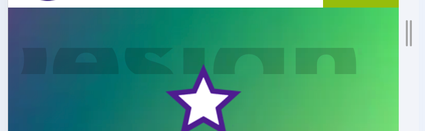
We want to place a star behind before a box. So we are applying CSS like this: .grve-feature-header #right::before { content: url(/images/grey-star.webp); width: 200px !important; position: absolute; left: -84px; top: 0px; z-index: -2; } All it does is to put the star in front of the box. The main DIV it is 'before' is relative positioning. So two questions: 1) how do I get this to show BEFORE the box (so it is behind it... maybe a bit sticking out the side) 2) how do I set it's width, as it refuses to change it... you might want it smaller on a phone, so being unable to do that is a drag.
-
It's that line height thing that's the problem. Sometimes it works if you use 50%.
-
Yes in fact I recently found that repeating code myself. It does need some additional em code in the CSS, but it does the job.
-
So it's impossible to make it the way I explained? IE if you had a slogan, and it had to be on two rows... you have to them make two rows of H2 tags.. and apply the gradient to each row? That's very awkward.
-
.class{ -webkit-background-clip: text; color: none; background: linear-gradient(#333333 45%, #000000 73%); -webkit-background-clip: text; background-clip: text; -webkit-text-fill-color: transparent; } I want to apply this gradient so it is lighter at the top, ie if it was white at the top and soft grey at the bottom. The problem is, if I do this to text that is bold and goes to two lines, the top line is one shade and the bottom is the other shade. Rather than might splitting the two rows into two tags, can this be done on a 'per line' basis?
-
So you can't do that if it's a H1 tag, since it is in a Text tag?
-
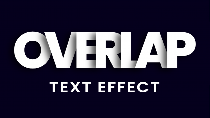
https://codingartistweb.com/2021/11/overlap-text-effect-with-html-and-css/ This is not an advert, I Want to know if I can create this effect, but without many many Spans down the page. So I can create a slogan, and apply this effect to it. Is that possible??
-
OH very cool, thanks. Though tI think I managed it in the end with some CSS, of relative positioning.
-
I Want to try and achieve this in CSS. Rigth now i have the full title in a H2 tag, with the final word in a Span. I know how to apply the styling to the word, but how do I: a) get it to be lower that the previous words and; b) make it go under the preview word (notice the b beneath the e). I don't really want to apply one word in Absoute Positioning, as on a phone etc it will be a nightmare.

-
I have a row of 2 columns. Left is an image, right is text. The image is cropped at the bottom, so when it gets to the width of a smaller device, I want to swap them over, so that they go 1/1 on each col, and the image is under the text. I tried Flex, but that forces it to be 50/50 width. I'm sure in CSS it is easy, but can't figure it out. Hope someone can help. I have tried this: @media only screen and (max-width: 950px) { #flex { display: flex!important; flex-flow: column!important; } #flex .grve-row { display: flex!important;} #left { order: 1!important; } #right { order: 2!important; } }
-
Hi. We know how to do the CSS to create a happy face bottom curve. but how do you do that to be a sad face - so the middle is up, and the sides are down? If you apply this class to a DIV/Row, it creates the Happy type. How do you make it so the middle is upper? .curved-bottom { clip-path: ellipse(100% 60% at 50% 40%); } Hope you can help. The plan is to put a row of three Tiles, and apply this to the row, so the tiles are "cropped" in a sad face style.
-
Mmmmm so what if you want the other rows to be black or plain white? You then have to set each row's background. I assumed you could set the background of the container as grey.
-
https://www.79design.org.uk/contact-us-2/ This is a duplicate of the page. Inspect it and you see the grve-section has a white background, but I can't override that, as it will affect all sections down the page. I did try it with the additional 'curved-bottom' in the class in CSS, but that didn't work. Any help would be terrific. And some many problems!