-
Posts
404 -
Joined
-
Last visited
-
Days Won
1
Everything posted by LeonLatex
-
Ok🤔 I was reading a little about it last night and understood it was only possible to get WP and some other ready-to-use CMS as described/asked in the opening, but then I know for sure. After I opened this thread, I found an incredibly good site online. I didn't know it was so many free developed CMS. You can see it by yourself at: https://www.opensourcecms.com/ There is listed hundreds of CMS on that site.
-
I am looking for a finished PHP / MySQL CMS such as. the forum PHPbb which can be posted on one's own server. I have no experience with Wordpress or Joomla and the other big ready to use CMS, but as I understand that these are designed so that they are only ready on a server where you have to register and get an account so you can point your domain for example to the Wordpress server. That is not what I am looking for. What I'm looking for is a CMS that I can download and extract/upload to my own server. Is there a CMS you can suggest for me? If you know about a DreamWeaver template system that would be nice and interesting too.
-
Are there any good book releases about HTML5 with good review that can be recommended? Only English, Norwegian or another Scandinavian language. Preferably released between fall 21 and now (Easter 22). Newest is better.
-
You saved me a lot of time, so i don't have to use time on reading me up on 5 pages describing the answer it takes only 4 lines to describe. Thanks, kicken 👍😊
-
-
A while ago I got an answer to the difference between .class and .id. Got a good and understandable answer there. The following question goes on almost the same. After <style> why does someone put only a * in front of a { What does this mean? Then there are two other things. I usually enter, for example, a class for a div, for example like this: div.font but then I see there are others who do not put anything in front .font - what is the difference? Other times, some enter only a # .font
-
Thanks kicken. I will try this later.
-
How to make a raster image adapt/fit to all resolutions? For that matter, a vector image as well. I mean as in the examples below: http://www.loopnet.com www.waldorfastoriabeverlyhills.com www.thedubaimall.com http://www.fabricliving.co http://www.theagencyre.com So, is it enough to oversize the image (eg 6000 * X pix) and put it in a div box? I have tried this, but it did not work. And even that will create white spaces around the image eventually? It did with me, but it's limited to how much I can increase the resolution of my equipment as well, so it's limited. Therefore, I have not been able to increase the resolution to more than a little over 2000 on the screen and tried with images ranging from 1024 and up. If the image is smaller than the box, I get some disturbance in the image. The position changes and everything that is not supposed to happen happens. How to make one image scale and stay in the same place as scaling up and down? I do not require you to set up any script for me, or give me finished things. I'm just asking you to tell me how and what is used, how it's done. Feel free to point me to a tutorial or something as well. I have not found that either. I asume it's used CSS..?
-
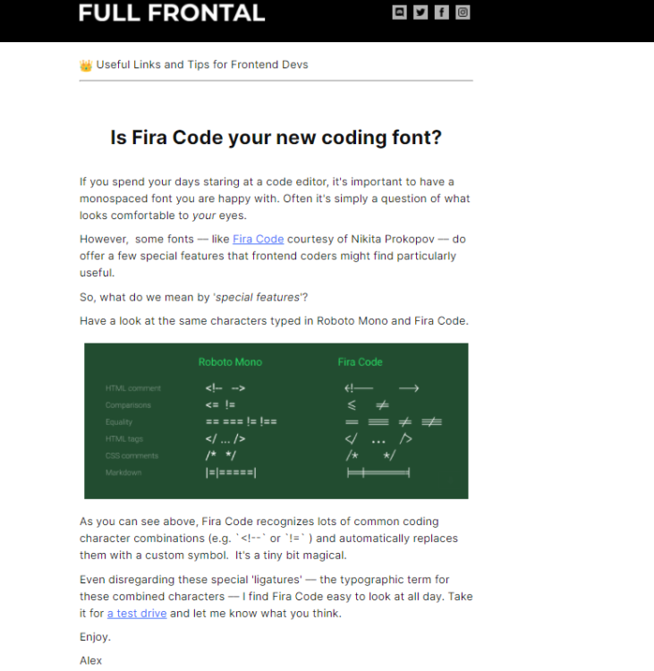
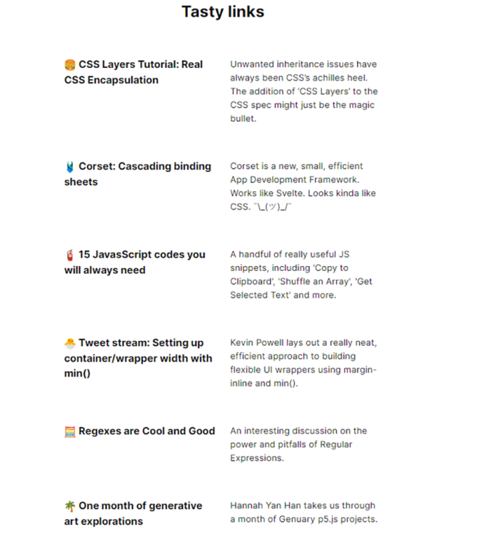
Today I received an email from "SitePoint" with an interesting thing that I thought others were interested in and getting to know. Sends with some screenshots from the email that describe what this is. Useful or not, I want to test it out.
-
That was what I needed to hear. Still a little confused, but I understand. I read a lot of information every day to learn and familiarize myself with something other than CSS1, and there is a lot of confusing info. Therefore, I ask. Sometimes i ask a question i already know the answere on to. Thats because i neaded a confirmation on what i already knew. I also see that you requinix open by asking me a question. Assume that this was only to open up for your answer. I understand that you understood what I ment by the way you answered me. And the way you explained to me what I really believed/already knew, but which I needed to get a confirmation of. Thanks 🙂 This is how I use CSS, to style and set up / have control over the layout / design. (so much has happened to CSS through CSS2 and CSS3 - so much new since CSS1)
-
Is it absolutely necessary with a wrap on HTML and BODY as long as you have a wrap on all DIV boxes / elements that are otherwise on the page? My wrap on both of these only has 100% on width and height, maybe padding, but I do not quite see the need to have a wrap CLASS on HTML and BODY at all. All my FLEX boxes are fixed or flex, and it makes no difference when I scale the page with or without flex on BODY and HTML. If it were to be to sew together elements / content on the page, this is done by position, margin and align property. If I'm wrong, please explain why? I can find no good explanation for why. If anyone should ask themselves why I wonder and i have done this, it is because I read about it on one of many pages I have read through, but of course I will not find it again. I mean there was a reason there too. But as usual there are sites for it and some sites not. e.g. then I found this one, but I do not get wise to it. wrapping everything inside the <body> in a <div> (usually classed or id as 'wrapper') you enable yourself to repeat HTML tags multiple times without your page structure breaking down.
-
I found this article wery interesting and usefull (Pasted below). When i have learned this properly i hope i understand it to the full and have solved the problem my self. Because i think my problem lies in when to use wich at the right moment in conjunction with which, or something like that. http://elad.medium.com/css-position-sticky-how-it-really-works-54cd01dc2d46
-
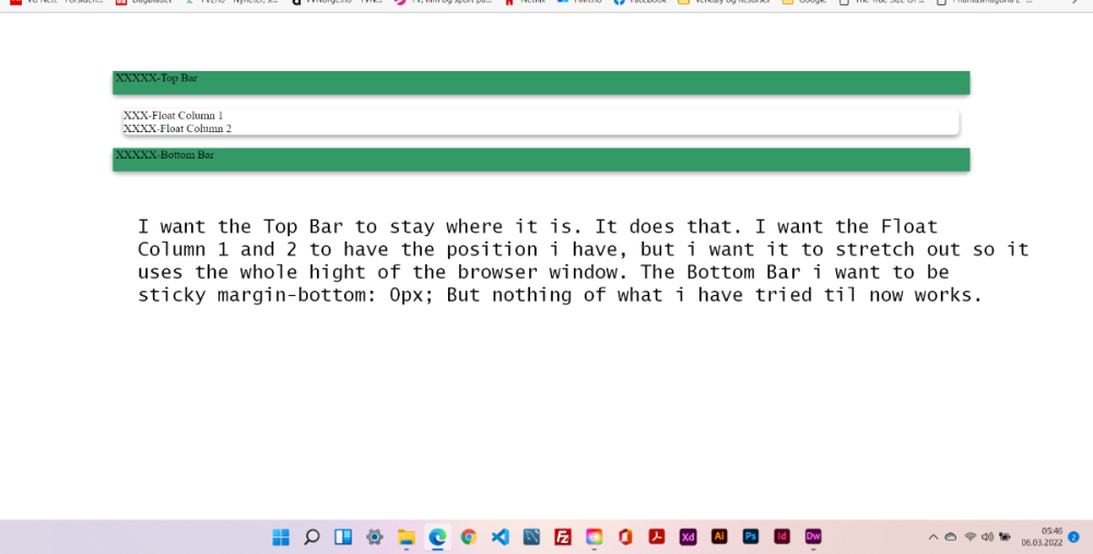
Yesssss, there it was. I knew i had done it before and this is how. Thank you kicken 🙂 But now the div doesent center any more with the margin: auto; I tried to change it to other different properties and values. Doesent work. Do you have any solution and tilps kicken? Sorry to forget to put back the property value in the first <div class=""> after <div class="wrapper"> . The properties value is: container_bar_bgB That didn't solve the problem requinix. I have done this before without a problem, but now i cant make it work. Below is the CSS and HTML + a image of how the site looks now with a explaining text what i want to happen. <!doctype html> <html lang="NO" class="size"> <head> <meta charset="utf-8"> <meta name="viewport" content="width=device-width, initial-scale=1.0"> <link href="css/wrapper_padding.css" rel="stylesheet" type="text/css"> <link href="css/logo_box.css" rel="stylesheet" type="text/css"> <link href="css/containers.css" rel="stylesheet" type="text/css"> <link href="css/text.css" rel="stylesheet" type="text/css"> <title></title> </head> <body class="padding"> <div class="wrapper"> <div class=""> <div class="column_logo"></div> </div><br> <div class="container_bar_bgT"> <div class="column_bar_top"> XXXXX-Top Bar</div> </div><br> <div class="float-container"> <div class="float-child"> <div class="green">XXX-Float Column 1</div> </div> <div class="float-child"> <div class="blue">XXXX-Float Column 2</div> </div> </div><br> <div class="container_bar_bgB"> <div class="column_bar_bottom"> XXXXX-Bottom Bar</div> </div> </div> </body> </html> @charset "utf-8"; /* CSS Document */ /*----Main-Content-Box---------------------------------------------------------------------------------------------------------------------------------------*/ div.float-container { width:78%; height: 100%; margin: auto; padding: 0px; border-top: 0px solid #e1e1e1; border-left: 0px solid #e1e1e1; border-right: 0px solid #e1e1e1; border-bottom: 0px solid #e1e1e1; box-shadow: rgba(0, 0, 0, 0.16) 0px 3px 6px, rgba(0, 0, 0, 0.23) 0px 3px 6px; border-radius: 7px; } div.float-child { width: 100%; height: 100%; margin: auto; padding: 0px; } /*-----------------------------------------------------------------------------------------------------------------------------------------------------------*/ div.container_bar_bgT { position: flex; width: 80%; height: 33px; margin: auto; margin-bottom: 1px; border-top: 0px solid #e1e1e1; border-left: 0px solid #e1e1e1; border-right: 0px solid #e1e1e1; border-bottom: 0px solid #e1e1e1; box-shadow: rgba(0, 0, 0, 0.16) 0px 3px 6px, rgba(0, 0, 0, 0.23) 0px 3px 6px; border-radius: 7px; } div.column_bar_top { flex-basis: 50%; width: 100%; height: 100%; margin: auto; background-color: #339966; } div.container_bar_bgB { position: flex; width: 80%; height: 33px; margin: auto; float-bottom: 1px; border-top: 0px solid #e1e1e1; border-left: 0px solid #e1e1e1; border-right: 0px solid #e1e1e1; border-bottom: 0px solid #e1e1e1; box-shadow: rgba(0, 0, 0, 0.16) 0px 3px 6px, rgba(0, 0, 0, 0.23) 0px 3px 6px; border-radius: 7px; margin-bottom: 100px; } div.column_bar_bottom { flex-basis: 50%; width: 100%; height: 100%; margin: auto; background-color: #339966; margin-bottom: 100px; }
-
I cant make the That didn't solve the problem requinix. I have done this before without a problem, but now i cant make it work. Below is the CSS and HTML + a image of how the site looks now with a explaining text what i want to happen. <!doctype html> <html lang="NO" class="size"> <head> <meta charset="utf-8"> <meta name="viewport" content="width=device-width, initial-scale=1.0"> <link href="css/wrapper_padding.css" rel="stylesheet" type="text/css"> <link href="css/logo_box.css" rel="stylesheet" type="text/css"> <link href="css/containers.css" rel="stylesheet" type="text/css"> <link href="css/text.css" rel="stylesheet" type="text/css"> <title></title> </head> <body class="padding"> <div class="wrapper"> <div class=""> <div class="column_logo"></div> </div><br> <div class="container_bar_bgT"> <div class="column_bar_top"> XXXXX-Top Bar</div> </div><br> <div class="float-container"> <div class="float-child"> <div class="green">XXX-Float Column 1</div> </div> <div class="float-child"> <div class="blue">XXXX-Float Column 2</div> </div> </div><br> <div class="container_bar_bgB"> <div class="column_bar_bottom"> XXXXX-Bottom Bar</div> </div> </div> </body> </html> @charset "utf-8"; /* CSS Document */ /*----Main-Content-Box---------------------------------------------------------------------------------------------------------------------------------------*/ div.float-container { width:78%; height: 100%; margin: auto; padding: 0px; border-top: 0px solid #e1e1e1; border-left: 0px solid #e1e1e1; border-right: 0px solid #e1e1e1; border-bottom: 0px solid #e1e1e1; box-shadow: rgba(0, 0, 0, 0.16) 0px 3px 6px, rgba(0, 0, 0, 0.23) 0px 3px 6px; border-radius: 7px; } div.float-child { width: 100%; height: 100%; margin: auto; padding: 0px; } /*-----------------------------------------------------------------------------------------------------------------------------------------------------------*/ div.container_bar_bgT { position: flex; width: 80%; height: 33px; margin: auto; margin-bottom: 1px; border-top: 0px solid #e1e1e1; border-left: 0px solid #e1e1e1; border-right: 0px solid #e1e1e1; border-bottom: 0px solid #e1e1e1; box-shadow: rgba(0, 0, 0, 0.16) 0px 3px 6px, rgba(0, 0, 0, 0.23) 0px 3px 6px; border-radius: 7px; } div.column_bar_top { flex-basis: 50%; width: 100%; height: 100%; margin: auto; background-color: #339966; } div.container_bar_bgB { position: flex; width: 80%; height: 33px; margin: auto; float-bottom: 1px; border-top: 0px solid #e1e1e1; border-left: 0px solid #e1e1e1; border-right: 0px solid #e1e1e1; border-bottom: 0px solid #e1e1e1; box-shadow: rgba(0, 0, 0, 0.16) 0px 3px 6px, rgba(0, 0, 0, 0.23) 0px 3px 6px; border-radius: 7px; margin-bottom: 100px; } div.column_bar_bottom { flex-basis: 50%; width: 100%; height: 100%; margin: auto; background-color: #339966; margin-bottom: 100px; }
-
I have tried that. It didn't work. But i will try again to see if it's posible i have made asomething wrong.
-
No, not margin or...maybe that can be used 🤔 The top and bottom layer i am talking about wil be sticky any way, so there's no broblem if they dont move along. I have used margin on many other ellements, but not here, because i want a a gap between </div> and <div> (old and new div). So i think thats the reason i didn't think about it. Maybe thats why i havent thought about that. It's realy a simple ansvere. So i am a little embarrassing. But you know (or maybe not - what do i know) it's not easy to be to cleare in the mind after bean awake for 18-20 hours. I went to bed after this post. Another question have came up. I have a div with a shadow I want it to have rounded corners on . But i can't make it work. Look at this code: box-shadow: rgba(0, 0, 0, 0.16) 0px 3px 6px, rgba(0, 0, 0, 0.23) 0px 3px 6px; radius: 7px; Or is radius only for border?
-
Without using <br>, how cane i create a space between "column_bar_top" and "float-container"? I tried with "display: grid; row-gap: 50px" and; "display: grid; column-gap: 50px". But that doesnt work. How can i make a gap between them without using a <br> or <p>? <div class="wrapping"> <div class="column_container_logo_bg"> <div class="column_logo">X-Heading/Logo</div> </div> <div class="container_bar_bgT"> <div class="column_bar_top"> XXXXX-Top Bar</div> </div> <div class="float-container"> <div class="float-child"> <div class="green">XXX-Float Column 1</div> </div> <div class="float-child"> <div class="blue">XXXX-Float Column 2</div> </div> </div> <div class="container_bar_bgB"> <div class="column_bar_bottom"> XXXXX-Bottom Bar</div> </div> </div>
-
Great contribution gizmola. Needed something like that. Flexbox is a huge boost in the CSS world. Have a lot left to learn about Flexbox in the CSS world. Therefore, such contributions as you made there are invaluable, even though I hate video / youtube tuts. I like to red books and on screen.
-
Thanks requinix. Lot to pick from there. I should have used Google my self, but i was so in nead about the thread i asked about, so i didnt even think about it 🤔🙄
-
A long time ago I found a thread here on PHP Freaks that I hope someone remembers or has knowledge of. I've searched and searched for it, but now I can not find it again. It is a thread on how to set up to get the best possible wrapper / container. Hope you understand what I mean by that. I'm not sure, but I think I found it under CSS. Do you remember such a thread that is detailed and has many other things than the usual properties such as height and width, padding etc. to make it both future-oriented and past-oriented and it did so it was scalable with regard to devices that the page is shown on. It also contained a good explanation of why it is done that way. Any .......?
-
Welcome back 🙂 I was afraid you were gone forever. Barand got me on better thoughts. So I have bean waiting at a enemy site for you to come back for more than a week. Finaly, i have a life again 😂🤪
-
When you say escape the slashes in the path i asume you mean put the whole string in double quotes. But the path is already in double quotes. So, exactly, what did you mean? Maybe I remember wrong or misunderstand the meaning of the word escape in this connection.
-
What is a bit of my point is the following. Regardless of unit and resolution, the DIV content box should stay in place right / left position, but extend so that the content text becomes readable by the DIV content box sliding under the DIV menu box. I know that this could be solved by the DIV menu box disappearing at and below a certain screen resolution and that the menu then becomes a drop-down menu, a kind of popup, but it is something I have no idea about. So I have to read up on that a bit. I have ordered 3 new books about HTML5 and CSS3. I know there is a chapter about this there, but the postal service especially in from england and usa as well as asia and australia is going sooooo slow now in these corona times. I found a exampel showing what i mean, and works excacly how i like it to work. Except the dropdown menu. https://www.toptal.com/responsive-web/introduction-to-responsive-web-design-pseudo-elements-media-queries But this one is not mine so i can't use it for my purpose. That is: Use it in a commercially system Thats why i want and have to develop my own.
-
reqinix: I dont follow you now. Its nothing wrong with the scrolling. It's when I resize the browser window.
-
It is a website with two DIV boxes. The one on the left / margin is a menu div box and the one to the right of it centered is the content. The menu box is locked with position: fixed; so that the menu does not follow scrolling. I have tried to lock the content box the same way, but it didn't help. works perfectly without any problems until I start resizs on window or screen resolution. Then the content DIV ends up under menu DIV regardless of whether I resize from the right corner to the left or the left corner to the right. The position in relation to the right margin is the same regardless of this. I atached the two css blocks and html for the DIV boxes. Hope someone sees what is wrong and can help me. Put me a little blind to a problem again. (this is from head) <link rel='stylesheet' href='https://www.w3schools.com/w3css/4/w3.css'> <link href="css/nav.css" rel="stylesheet" type="text/css"> <link href="css/contact.css" rel="stylesheet" type="text/css"> nav.css div.menu_box { position: fixed; top: 156px; left: 10px; width: 165px; height: 300px; border: solid 1px; border-color: #ffcc99; border-radius: 7px; } div.content_box { position: fixed; margin-top: 5px; width: 950px; height: 87vh; margin: auto; border: solid 1px; border-color: #ffcc99; border-radius: 7px; } mnu.php <div class="menu_box w3-content w3-card-4 w3-padding w3-light-gray w3-left" style="line-height: 6px"> <!--<h4 class="headline_bold">Naviger</h4>--><br> <p><a class="link.php" href="index.php" title="Tilbake til Start">Hjem</a></p> <p><a href="link.php" title="Hva kan vi tilby">Hva tilbys</a></p> <p><a href="link.php" title="Opplysning">Opplysning</a></p> <p><a href="link.php" title="Poteter">Poteter</a></p> <p><a href="link.php" title="Historie">Historie</a></p> <p><a href="link.php" title="Kontakt">Kontakt</a></p> </div> (paste into) index.php <?php require_once("header.php") ?> <?php require_once("mnu.php") ?> <!--Conten Boxt Start--> <div class="w3-content w3-card-4 w3-padding w3-light-gray"> <!-- Content Start --> <h4 class="headline_bold">Test text goes here.</h4> <h3 class="content">Test text goes here.</a>.</h3> <h4 class="headline_bold">Test text goes here.</h4> <h3 class="content">Test text goes here.</h3> <h4 class="headline_bold">Test text goes here.</h4> <h3 class="content">Test text goes here.</h3> <h3 class="content"> </h4> <h3 class="contact_link" style="font-size: 13px">Leon</h3></a> <!-- Content slutt --> <!-- content box slutt --> </div> <!-- Footer Start --> <?php require_once("footer.php") ?>


